
6 Ways Responsive Web Design Matters
When you go online to a new website and notice something is missing, doesn’t it make you mad? By now you know how we feel about quality web design Southampton! There is no excuse for a lack of responsive web design. Or if the corner of a webpage suddenly disappears when you scroll down, do you ever wonder why? Don’t you hate it when you can’t find the button you need to click on and spend ages searching, only to realise half of the website has been cut off because you are viewing the site on a mobile phone?
It is thought that more than 90% of shoppers use mobile devices and nearly 75% use them whilst in store. Did you know that 80% of the time spent on mobile phones is just using apps? It’s not just mobile phones either, 72% of tablet owners purchase online.
So the influence mobile devices have in modern business is not to be underestimated. Look at how vital social media is for reaching online customers. Therefore, your business needs to embrace the use of mobile devices for online shopping. The best way to do that? Is simply just to have responsive web design in your business website.
Learn more about responsive web design
1 ) Flexibility
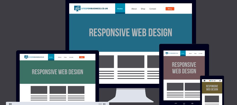
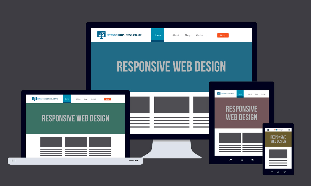
Responsive Web Design (RWD) is the laying-out and coding in websites that allow them to be viewable in multiple formats, most obviously mobile devices. It makes the website format adaptable and makes resizing, panning, and scrolling adjustable in relation to the device being viewed. At the very least, using fluid grid design layouts are a must.
2) Cost effective
In the grand scheme of website budgets, it really won’t cost that much more. Ideally, every web designer should be making sure your business is anticipating all possible customer-facing experiences, thorough testing should apply in all formats. Responsive web design is in fact considered best practice in the web design industry.
3) User experience
As we’ve said above, when people use websites and they can’t access vital parts it’s because the standard grid layout doesn’t match the format. It will make a negative impact on the user’s shopping experience. As we know from previous blogs, bad user experiences mean fewer sales. Google also consider user experiences in its SEO ranking. However, even based solely on customer reviews your website is going to face strong criticism. If you want decent visual content then you might need to learn a bit about Scalable Vector Graphics.
 4) Google loves it.
That’s all you really need to know. Let’s not pretend we don’t know the momentous influence Google has on website and SEO content. The more detailed explanation is that mobile sites have one URL and HTML. This makes it easier for Google to analyse during SEO searches. Multi-platform usability experience is favourable for SEO.
5) Greater sharing range
So with web content on mobile formats getting shared more, it naturally creates a wider impression range. With all that data getting shared via mobile devices then Google will naturally favour responsive web design. Therefore it is crucial to test your web design on as many different formats and devices as possible.
6) Easier to manage
The internet is clearly evolving towards mobile device sharing so with the rise of apps and phone tablet use, software is growing to manage multiple social media formats from mobiles devices. Responsive web design will be a huge part of making that happen. If you look at programs like Hootsuite then you know how far along we are.


Leave a Reply